FONT SYSTEM FOR A LEGIBLE AND FLUENT TEXT
OMOTYPE ENHANCES LEGIBILITY AND READABILITY OF THE TEXT
Designed with all the features proven to facilitate reading, improve letter detection and recognition. Dyslexics also read faster, with fewer mistakes and less effort.
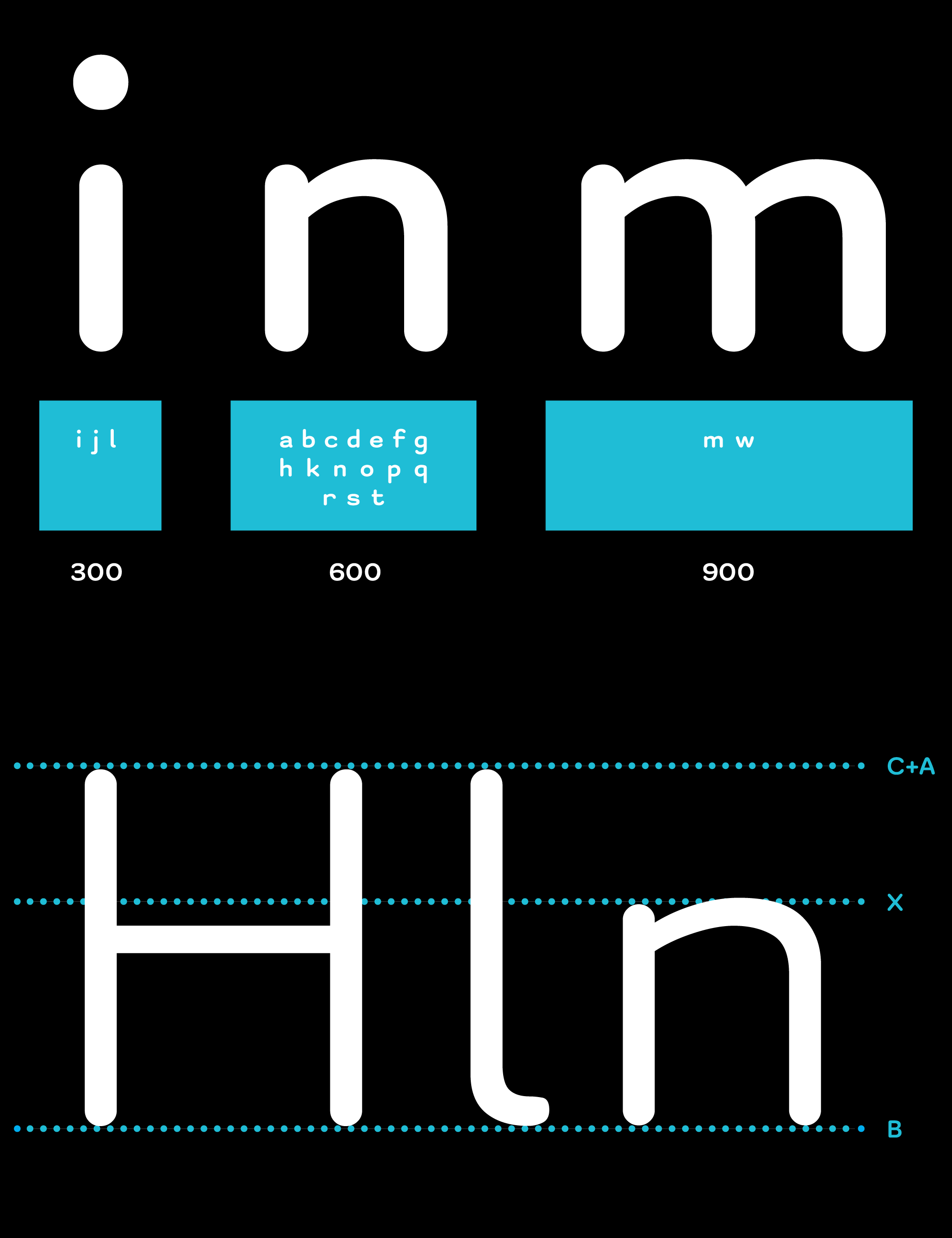
Typefaces are the foundation of visual reading experience. The unified width of the letters helps with letter detection and recognition as well as improves text readability.
We combined the two principles of type design. The first principle is to be like monospace fonts where each letter has the same width. The second is to have proportional letter width as usual fonts. This enabled narrow letters to remain narrow (i,j,l), wide letters to remain wide (m,w), and for words to be clear, without deformation. The result was the high readability and legibility typeface.

OmoType is also shaped with features that are proven to facilitate reading:
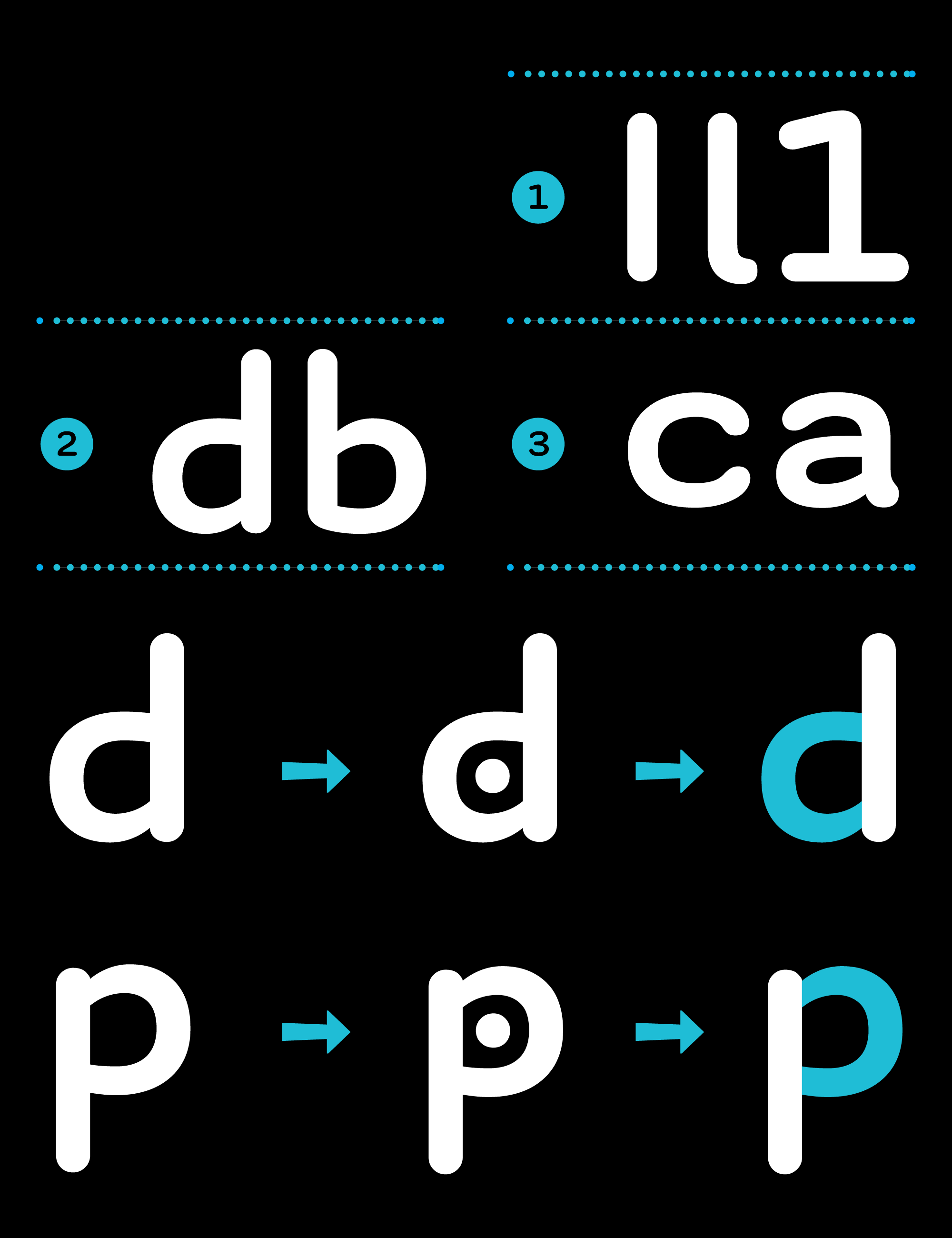
Letters that are uniquely recognizable
Similar letters that are easily distinguished
Longer ascenders and descenders of the letters for distinguished word shape
Letters that clearly define the text line, letter spacing, and spacing between words
Similar shapes have recognizable elements so it would be easier to differentiate them
Also, circular shapes are created to avoid symmetry, while letter endings are emphasized and extended.

WHY DO WE FEEL OMOTYPE IS THE MOST READABLE TYPEFACE?
Dyslexia is not a visual but rather a language-based learning disorder. But people with dyslexia and reading difficulties have a need for clear and understandable text. Most research confirms that the selection of typeface plays an important part as well as some other adjustments of the text.
So we started creating a font system that would be the most comfortable for them. But at the same time to offer a superior reading experience to everyone. To achieve that our typographers and dyslexia experts used data from relevant scientific research about font readability and dyslexia.
During the development, we did a couple of research with dyslexic children to verify its effectiveness. It shows children read faster, make fewer mistakes, and have shorter fixation times when reading with the OmoType. The results are published in a whitepaper on comparative research and eye tracker research.
Much like with everything else, the choice of font is about personal preferences. During the research, children reported a higher preference rate for OmoType than other fonts (Arial, Times New Roman, Open Dyslexic).
We are receiving feedback from kids to adults, with regular reading ability and struggling readers as well. Most of the feedback shows improved reading experience than they were able to achieve before.
OmoType is currently used by tens of thousands of users, schools, speech therapy offices, in digital and printed editions, applications, websites, etc.
Apart from users with reading difficulties, a large number of the users are strong readers.

DYNAMIC FONT SYSTEM FOR EVERY NEED AND TASTE
One additional benefit is that the OmoType is a dynamic font system. It is designed to be adaptable to the specific needs of each reader. It has 240 different styles, with 5 different extender sizes, 4 different letter spacings, and 6 different weights. The vast number of styles enables the choice of the type for specific purposes, age groups, and their reading levels. While a person with regular reading skills will enjoy reading on any version, a person with lower reading ability will most likely use a version that provides clearer word shapes.
This way OmoType covers almost all the needs and tastes of every reader. Its dynamic capabilities get fully used in apps like Lexie or ReadAble.
WHY IS OMOTYPE A GREAT FIT FOR CHILDREN’S BOOKS?
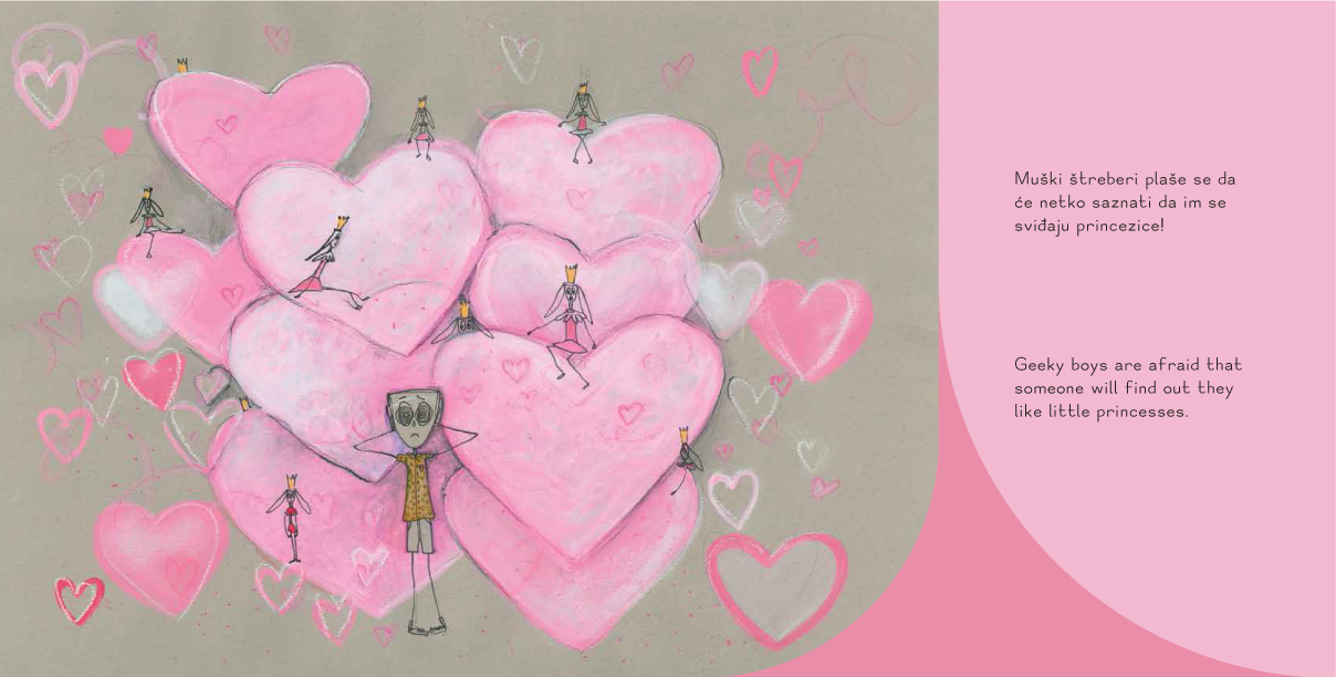
OmoType Sans is a humanistic handmade font with less complex shapes and improved character recognition perfect for younger readers
OmoType design elements make it amazing both for kids with regular and low reading ability as well as children with reading difficulties
Dyslexic children read with shorter fixation times which indicates less mental effort required to read with OmoType
