OmoType
Situation in which none of the existing fonts have been succesful in solving the reading problems of the people with dyslexia in an efficient manner and with proficient user experience, led to the development of the OmoType font system. OmoType font family was designed by the designer and typographer Marko Hrastovec.
When we started developing a font for people with dyslexia, our aim was to design a font that would not differ much from the fonts that are in everyday use. At the same time, it was supposed to enhance readability, line tracking and prevent similar letters reversing by marking or deforming only those “problematic” letters. Through the process of designing and testing on a group of children with reading difficulties, we noticed that the readers of different levels have different preferences when it comes to font design. Therefore, we considered the font as something dynamic, adjustable to the unique needs of the individual user.
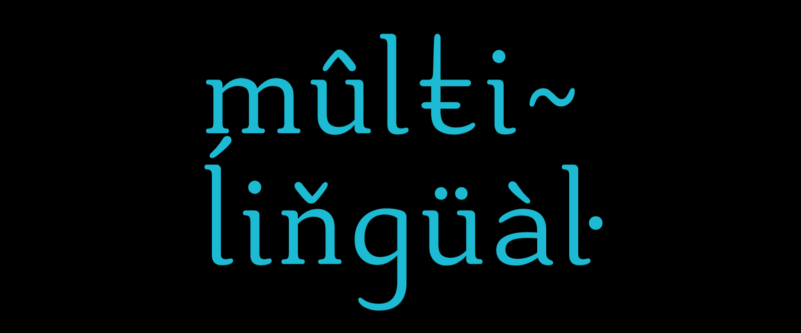
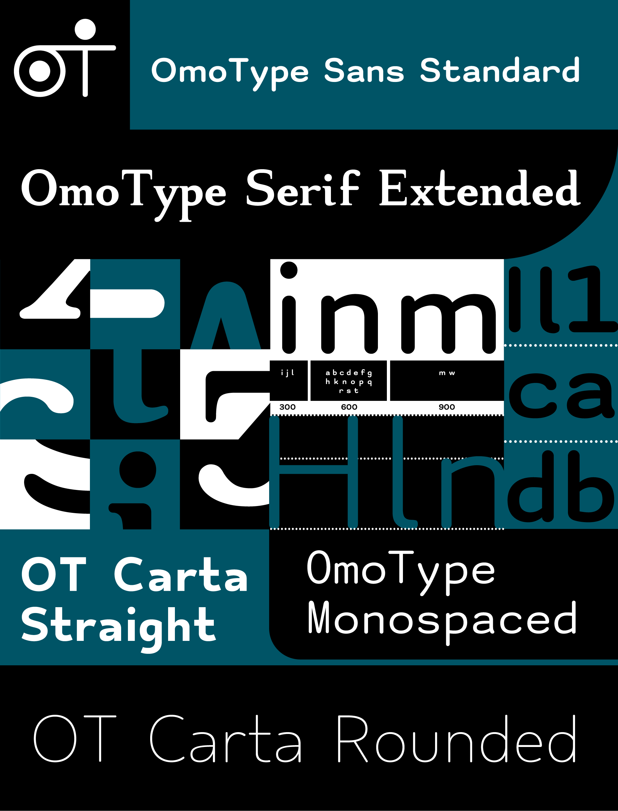
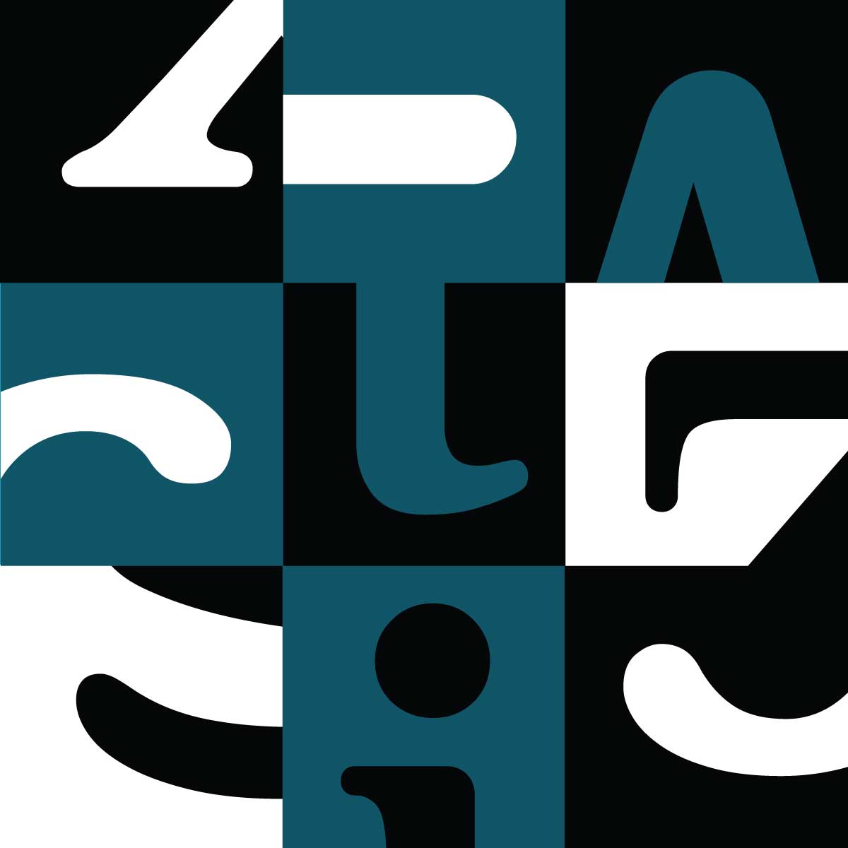
OmoType Sans has more than 240 different styles which differ in thickness (light, regular, book, medium, bold, black), the height of upper and lower extensions of the letters (A, B, C, D, E, F) and character spacing (One, Two, Three, Four). The increased height of extensions of the letters emphasises the shape of the word and facilitates readability, while character spacing prevents crowded letters and makes it easier to identify the letters.
OmoType font system enables the transition from a bad reader to an accurate reader through the decrease of letter deformity towards the style which does not differ from the fonts that are in everyday use.
Background
With monospaced fonts, every symbol – letter, number, punctuation etc. (and the space around the symbol) is of the same width. That means that the usually narrow symbols (i, j, l) and wide symbols (m, w) are adjusted to a standardized width, and as a consequence they have a stretched or narrowed form which is not as readable as the ones that have proportional width.
According to our previous experience and research on the topic of font readability with people with dyslexia, it was concluded that unified width of letters helps with the detection of forms (recognition) and reading (readability).
Since it is possible to place most of the letters in the same space, without being deformed significantly, a system with three widths was devised (300, 600 and 900 units). It enables the narrow letters to stay narrow, wide to stay wide and the image of the word to stay quite similar to the one using monospaced fonts. That way we connect the two principles of font design with a purpose of creating a new one – OmoType – aimed at the needs of people with reading difficulties.
Independent testing and research have shown that children with dyslexia read faster, with fewer mistakes, and use less mental power when reading with OmoType font in comparison to Arial, Times New Roman and Dyslexie Font.
OmoType font system offers its full affirmation through the Omoguru digital tools for people with reading difficulties.
OMOTYPE FONT FAMILY EXPANSION
In order to meet the different habits and applications, we have continued to develop, and shape new letters based on the characteristics that have proven to enhance readability.
Variable OmoType Sans
Since OmoType Sans consists of 240 different styles, and each has over 400 different symbols, it often overloads the functioning of web and mobile apps. Therefore, we have developed a variable font which contains all OmoType styles within one file (less than 1MB). The implementation of this solution optimises the app for which it is used.
OmoType Serif
The analysis of the way it is used and the preferences of users of Omoguru Reader app have shown that the minority of users, used to the Times New Roman font, prefers serif fonts. Also, for some of the users, especially those with severe attention disorder, frequent changes of font reduce fatigue while reading. All of the above mentioned, as well as the need to share the usefulness of our solutions, resulted in designing of the OmoType Serif font family.
OmoType Serif comes in Standard and Extended versions with 48 styles which differ in the height of the upper and lower extensions of the letters. The serif version contains all the other important characteristics of readability of the OmoType font family.
OmoType Mono
Specific purposes call for specific solutions. Monospaced version – the one in which all the letters are of the same width – is intended for developers, chemists, physicists and mathematicians or for all who make or use technical and natural sciences content. Monospaced font versions are generally the most readable because they offer more space between letters and facilitate identification. OmoType Mono has 48 styles and, as the rest of OmoType versions, is divided into 6 thicknesses and 4 character spacings.
OT Carta
OT Carta font family is mostly intended for adult readers who are used to sans fonts such as Helvetica or Arial. OT Carta fonts were designed by Nino Bodač, designer and typographer.
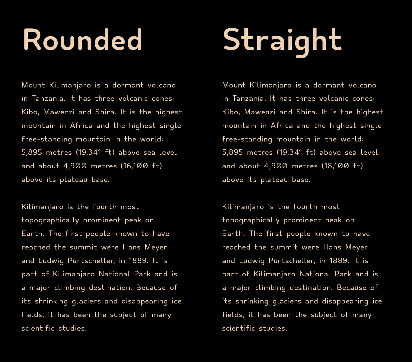
OT Carta comes in two sans versions: Rounded with rounded terminals in Standard, Extended and Mono styles, and a Straight version with straight terminals, also in Standard, Extended and Mono styles.
As with the rest of OmoType fonts, it also offers all the important characteristics which affect readability.
OT Carta fonts are used also in printed editions since they keep the characteristics of readability and at the same time take less space than the rest of the OmoType fonts (except Mono version).