OmoType Serif
The analysis of the way it is used and the preferences of users of Omoguru Reader app have shown that the minority of users, used to the Times New Roman font, prefers serif fonts. Also, for some of the users, especially those with severe attention disorder, frequent changes of font reduce fatigue while reading. All of the above mentioned, as well as the need to share the usefulness of our solutions, resulted in designing of the OmoType Serif font family.
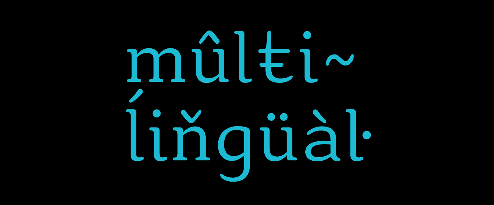
OmoType Serif comes in Standard and Extended versions with 48 styles which differ in the height of the upper and lower extensions of the letters. The serif version contains all the other important characteristics of readability of the OmoType font family.